
Pigment Yellow 110 (HP Yellow 1315): Applications, Qualification, and Buyer Checklist

Pigment Yellow 138 Buyer Guide: How to Qualify a Supplier (TDS, SDS, COA)
Pigment Orange 34 (HP Orange 3646) — Opaque Type: A Best‑Practice Guide
Pigment Yellow 14 for Solvent-Based Gravure and Flexo Inks: High Flow and High Gloss on Films and Paper
Pigment Blue 15:0 (PB15:0): definition, properties, and where it fits
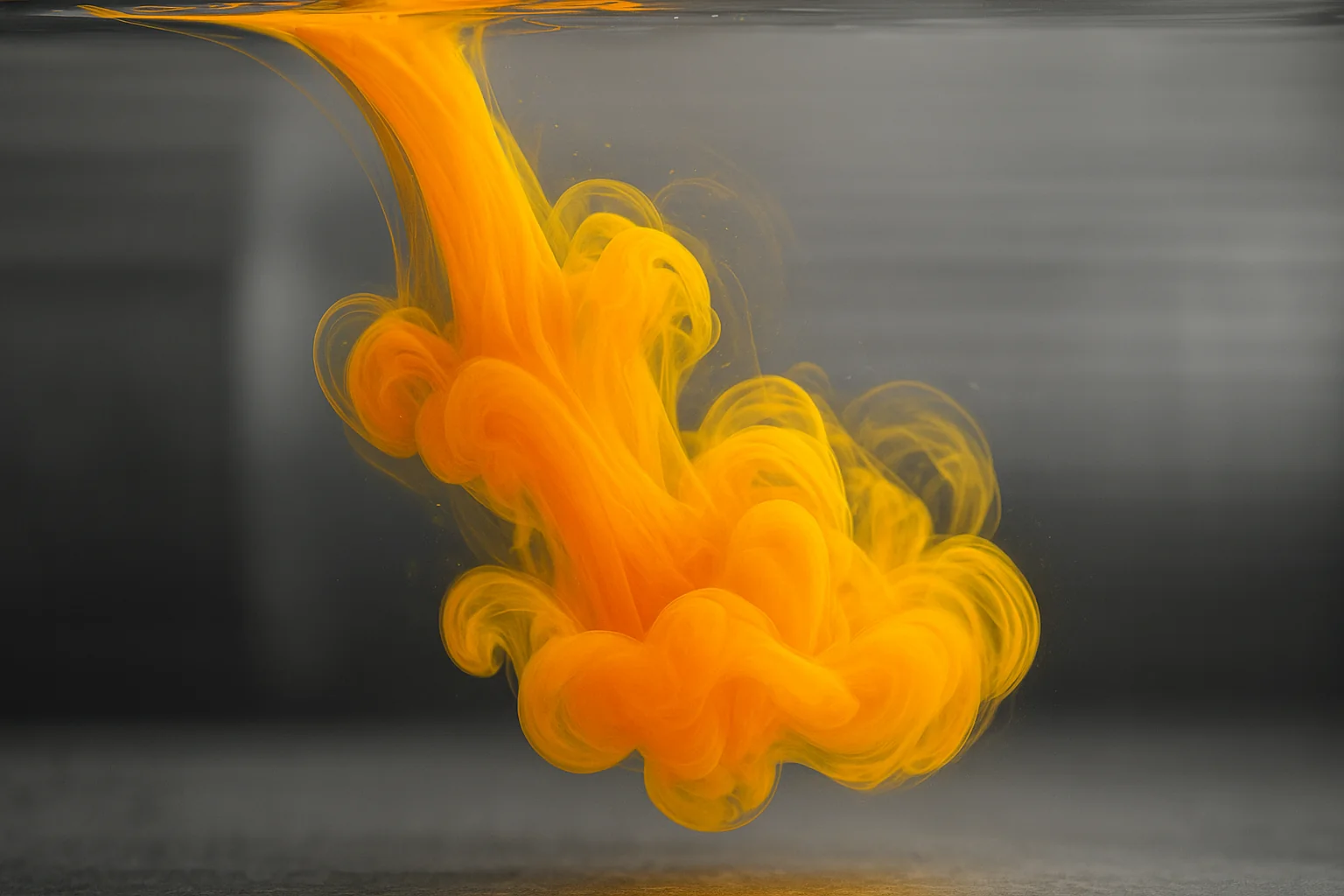
Pigment Yellow 139 (PY139) is a red-shade organic yellow that shows up most often where ink makers need a clean warm yellow, strong color development, and robust performance under real press conditions—especially when color consistency and fastness are non‑negotiable.
This article focuses only on printing-ink applications. You’ll see where PY139 is typically used, what to evaluate first (shade, transparency/opacity, dispersion, and fastness), and a set of best practices that help both procurement and formulation teams qualify the right grade with fewer surprises.
Pigment Yellow 139 in printing inks: where it fits
PY139 is commonly selected for high-quality printing inks across multiple printing processes when a warm, slightly reddish yellow is desired. In practice, the “fit” depends less on the Color Index name and more on how a given grade behaves in your binder/solvent system and on press.
Typical ink-use patterns include:
Packaging inks (flexo and gravure): when color strength and resistance requirements (rub, solvent, migration management) are high.
Publication and commercial printing (e.g., offset): when color control and reproducibility matter and the ink set needs to stay within defined color/transparency windows.
Ink systems that require controlled transparency/opacity: because pigment particle engineering can shift PY139 from more transparent to more opaque presentations.
Key takeaway: For PY139 ink applications, assume you’re buying a performance package (shade + dispersion behavior + fastness + documentation), not a commodity “yellow.” Qualify the grade in your exact resin/solvent system.
What ink formulators evaluate first
1) Shade control and batch-to-batch consistency
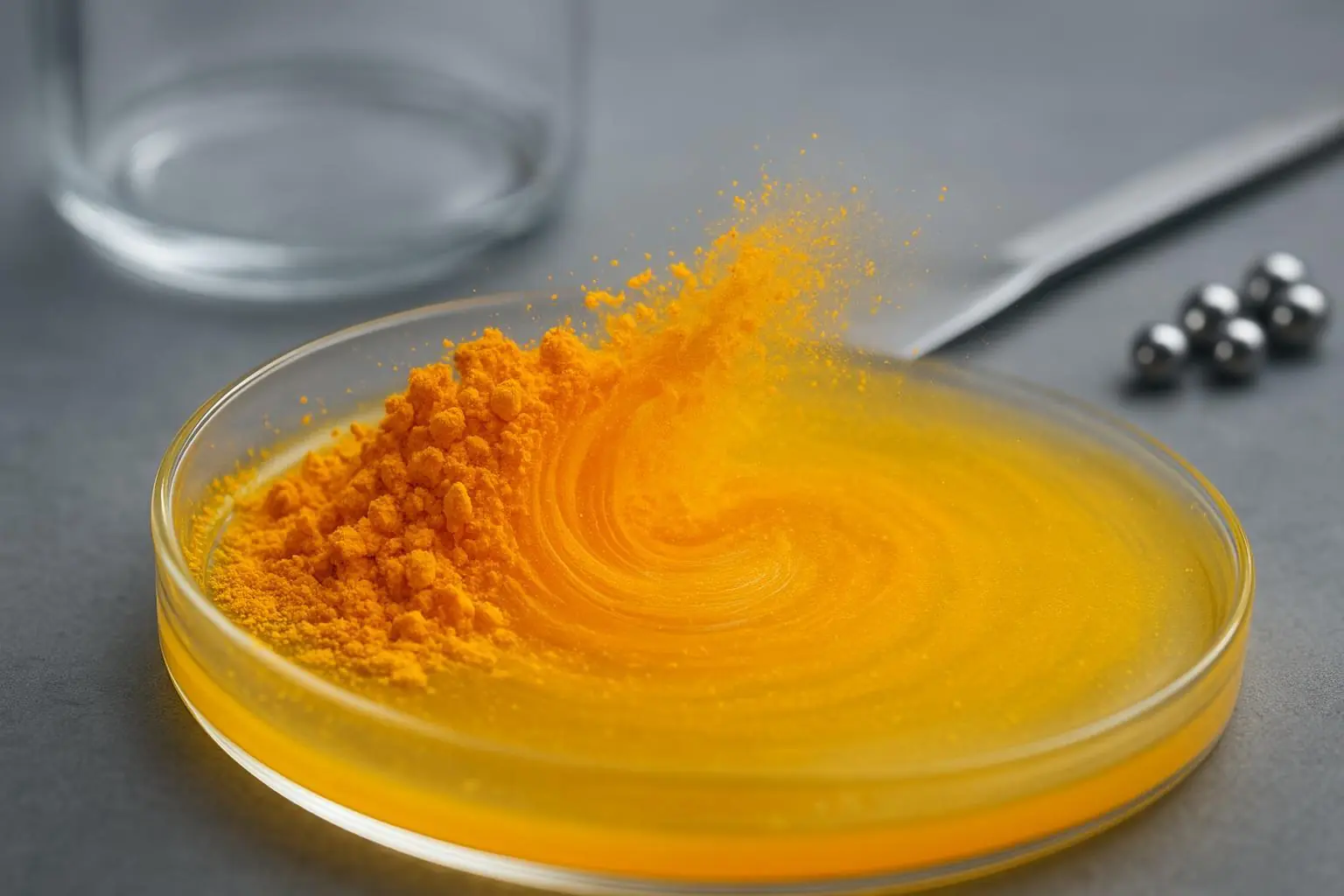
Pigment Yellow 139 is known for its red-shade yellow direction, but different commercial grades can land noticeably differently in masstone and tint. The practical cause is usually a combination of particle size distribution и surface treatment, which impacts both hue and hiding/clarity.
What to test early
Drawdowns at target strength and a standard reduced strength (e.g., 1/3 strength) using your internal method.
A/B comparison across two lots to quantify batch-to-batch drift.
Common failure mode
A grade that matches hue at full strength but shifts in tint, causing unstable color matching across SKUs.
2) Transparency vs. opacity (and why it matters in real print)
In inks, transparency/opacity isn’t a cosmetic preference—it affects:
Overprint behavior (especially in process printing)
Trap and tone reproduction
Color build and gamut
For teams working with four-color process inks, the standardization mindset is well captured by ISO’s color/transparency approach; see the ISO overview for ISO 2846-1: Graphic technology — Colour and transparency of process inks for the concept of controlling color and transparency targets for consistent reproduction.
Common failure mode
Unexpected opacity reduces overprint brightness or shifts secondary colors.
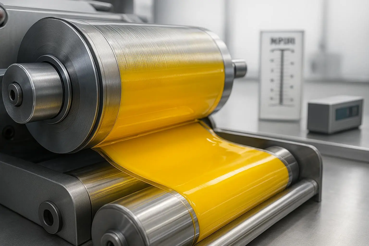
3) Dispersion quality in ink (the hidden cost driver)
“Pigment Yellow 139 dispersion in ink” is where formulation and operations meet. Poor dispersion shows up as:
specks / grit,
viscosity drift,
unstable color development,
higher milling energy and longer cycle time.
What to test early
Standard grind gauge results (per your SOP)
Viscosity at defined shear conditions
Color development curve (drawdowns across dispersion time)
Common failure mode
A grade that looks fine after aggressive milling but is unstable in routine production—creating variability and scrap/rework risk.
4) Fastness and resistance: tie requirements to end-use
Ink performance requirements vary by substrate, print process, and downstream exposure (rub, solvents, heat, light). Instead of “excellent fastness” as a generic statement, treat fastness as a matrix:
light exposure expectations,
solvent and chemical contact,
mechanical rub/abrasion,
heat during drying/curing.
Common failure mode
Selecting by shade first, then discovering resistance limitations late in customer qualification.
Best practices for using Pigment Yellow 139 in ink formulations
Best practice 1: Qualify PY139 in the exact resin/solvent system you will run
Why it matters: The same pigment can disperse and stabilize very differently between NC, PU, acrylic, or water-based systems.
How to implement
Use your production-relevant letdown and resin package for lab drawdowns.
Run a short stability screen (viscosity and color drift) after defined storage intervals.
Failure mode to watch
“Lab pass, plant fail” due to differences in milling energy, temperature profile, or letdown order.
Best practice 2: Treat transparency/opacity as a spec, not an observation
Why it matters: Transparency impacts overprint and color build; opacity affects hiding and visual density.
How to implement
Define a measurable internal benchmark (even a relative standard) for transparency/opacity.
When applicable, align internal targets to process-ink control thinking as described in ISO 2846-1: Graphic technology — Colour and transparency of process inks.
Failure mode to watch
Unexpected shifts in secondary color build (e.g., greens/oranges) during production.
Best practice 3: Build a dispersion “minimum viable process” that production can repeat
Why it matters: The best pigment on paper is a problem if it demands heroic dispersion to perform.
How to implement
Define the minimum dispersion time/energy that achieves your color and grind endpoints.
Validate that endpoint across multiple lots.
Failure mode to watch
One lot requires extra milling, quietly increasing cost and creating delivery risk.
Best practice 4: Standardize incoming QC documentation for faster qualification
Why it matters: Procurement teams need comparability, and technical teams need traceability.
How to implement
Require SDS/TDS and a COA format that your QC can map to internal acceptance criteria.
Lock down change-control expectations (what constitutes a “material change”).
Failure mode to watch
Re-qualification triggered by undocumented changes—costly for both supplier and customer.
Packaging inks: compliance and documentation checkpoints
If Pigment Yellow 139 is used in packaging inks (especially where there is any food-contact compliance program in the supply chain), your pigment selection and documentation discipline matter as much as your color match.
Two useful references from the European Printing Ink Association (EuPIA) are:
The EuPIA Guideline on Printing Inks applied to Food Contact Materials (2023), which explains GMP expectations and how ink makers manage raw materials in food-packaging contexts.
The EuPIA Exclusion Policy for Printing Inks and Related Products (2023), which outlines hazard-class-based exclusions for substances used in inks.
These documents do not replace your local regulatory requirements, but they provide a widely recognized framework for raw material governance и documentation readiness in packaging-ink supply chains.
Pro tip: For packaging ink projects, align pigment qualification with your customer’s compliance workflow from day one—SDS/TDS/COA format, change control, and traceability are often gating items.
Where HP YELLOW 15157 fits (and how to qualify it efficiently)
If you are evaluating a PY139 option for high-quality ink formulations, HP YELLOW 15157 is Honor Pigments’ Pigment Yellow 139 offering.
A practical way to qualify it (and compare it to incumbents) is to request a small, decision-ready package:
A lab sample for your standard dispersion route
SDS/TDS and COA examples aligned to your internal QC checks
Guidance on recommended binder/solvent compatibility and dispersion approach for your ink system
Because grade-to-grade differences can show up most clearly in dispersion behavior and transparency/opacity, treat the sampling phase as a controlled comparison—not a one-off drawdown.
FAQ
Is Pigment Yellow 139 suitable for both offset and packaging inks?
It is commonly used in multiple printing-ink processes, but suitability depends on the specific grade and your binder/solvent system. Validate shade, transparency/opacity behavior, dispersion, and resistance using your production-relevant method.
Why do different PY139 grades look different if they share the same CI name?
Commercial grades can vary in particle size distribution and surface treatment, which affects hue, transparency/opacity, and how the pigment disperses and stabilizes in a given ink vehicle.
What documentation matters most when qualifying Pigment Yellow 139 for packaging inks?
Beyond color performance, packaging projects often hinge on documentation discipline (SDS/TDS/COA, traceability, change control). EuPIA’s guidance documents are useful frameworks to align internal workflows.
Next steps
If you want, share your ink system (process + binder + solvent family) and your key targets (shade direction, transparency/opacity, resistance requirements). We can then map a clean qualification checklist and the exact lab tests to run for Pigment Yellow 139—so procurement and R&D are aligned before sampling.